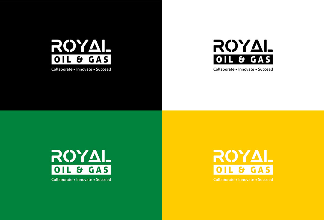
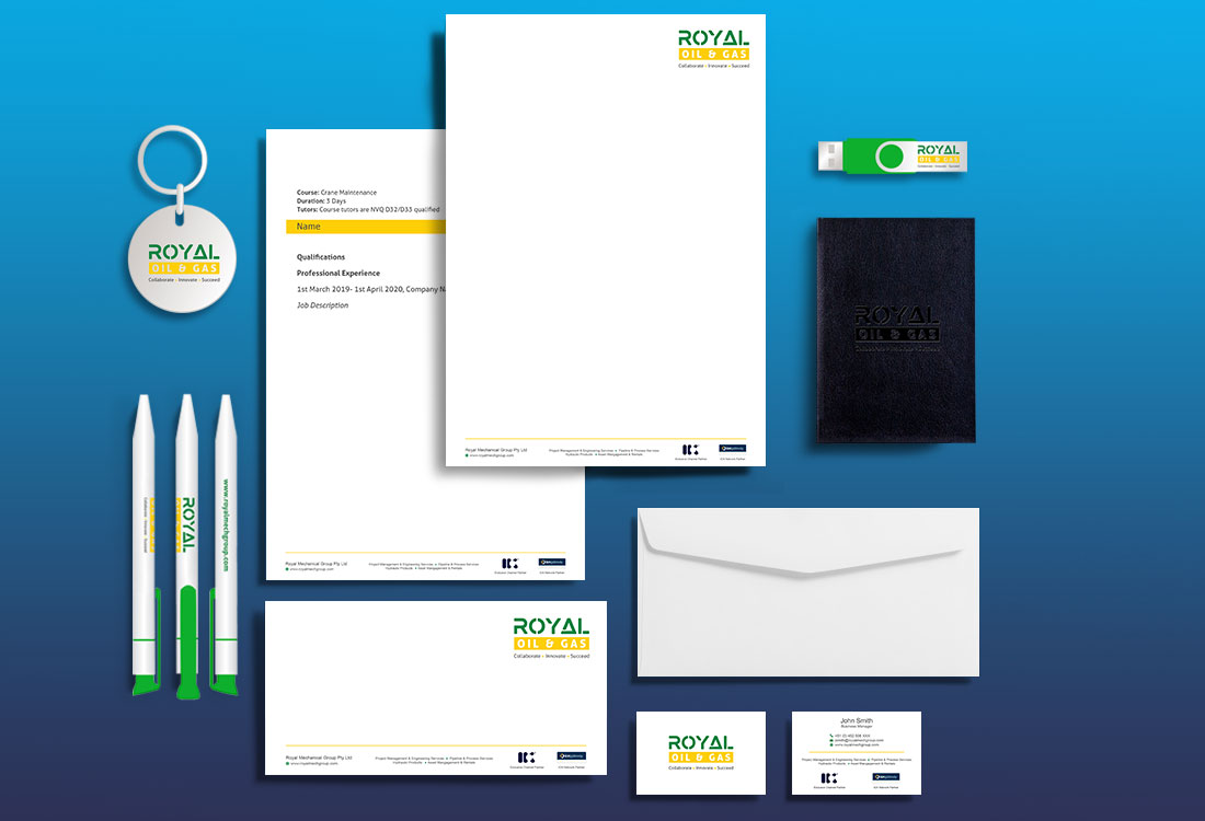
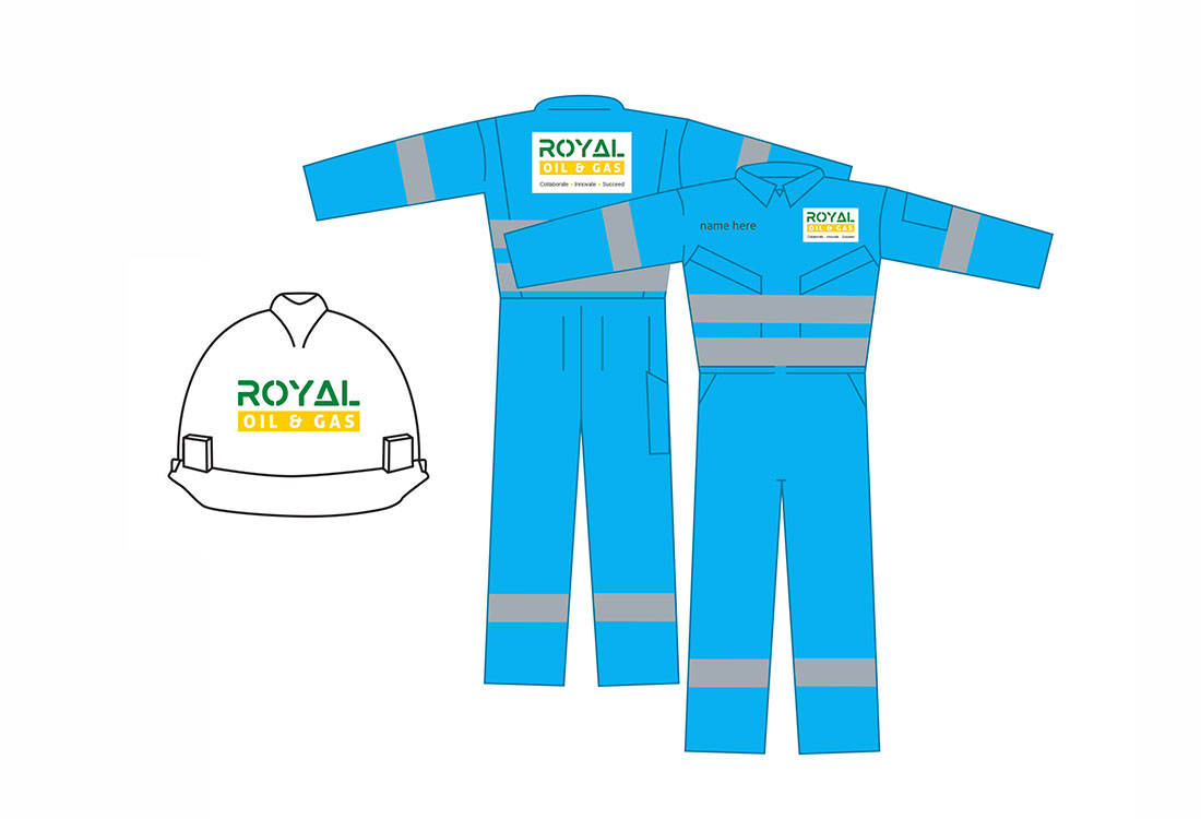
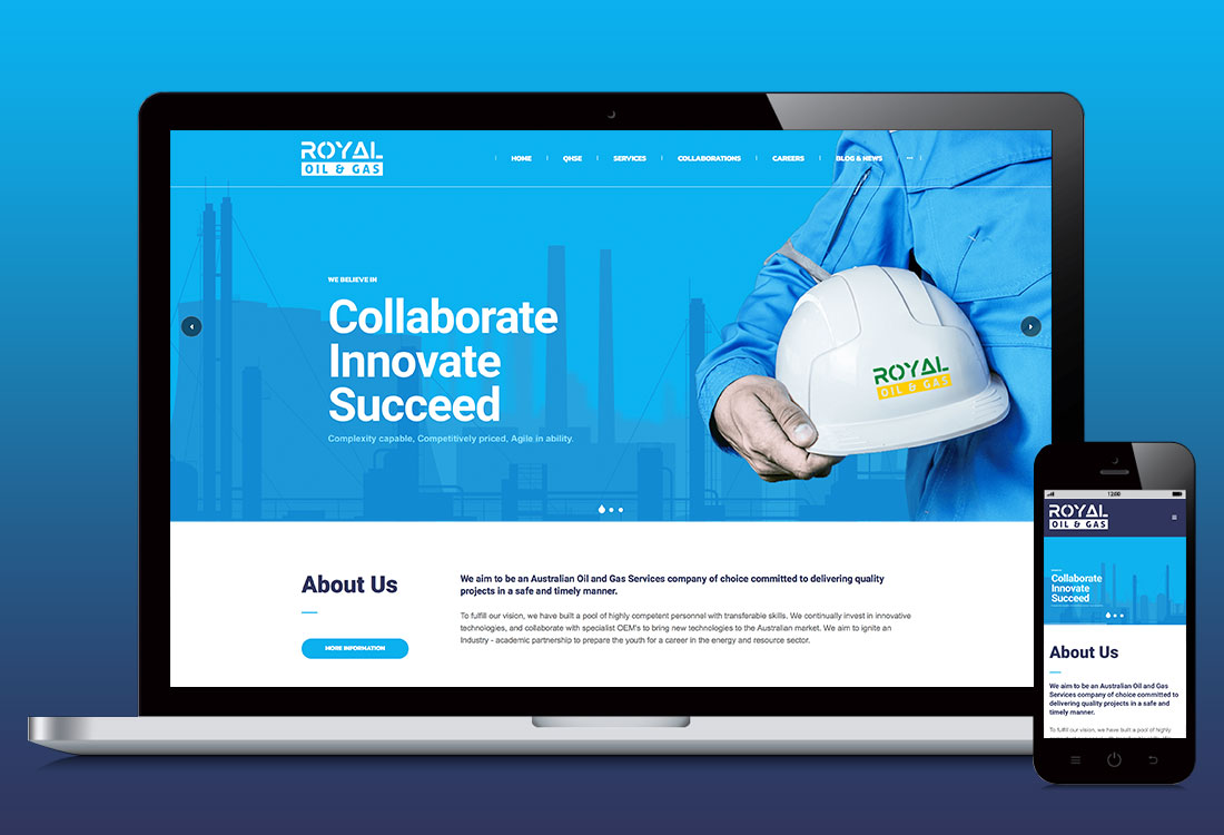
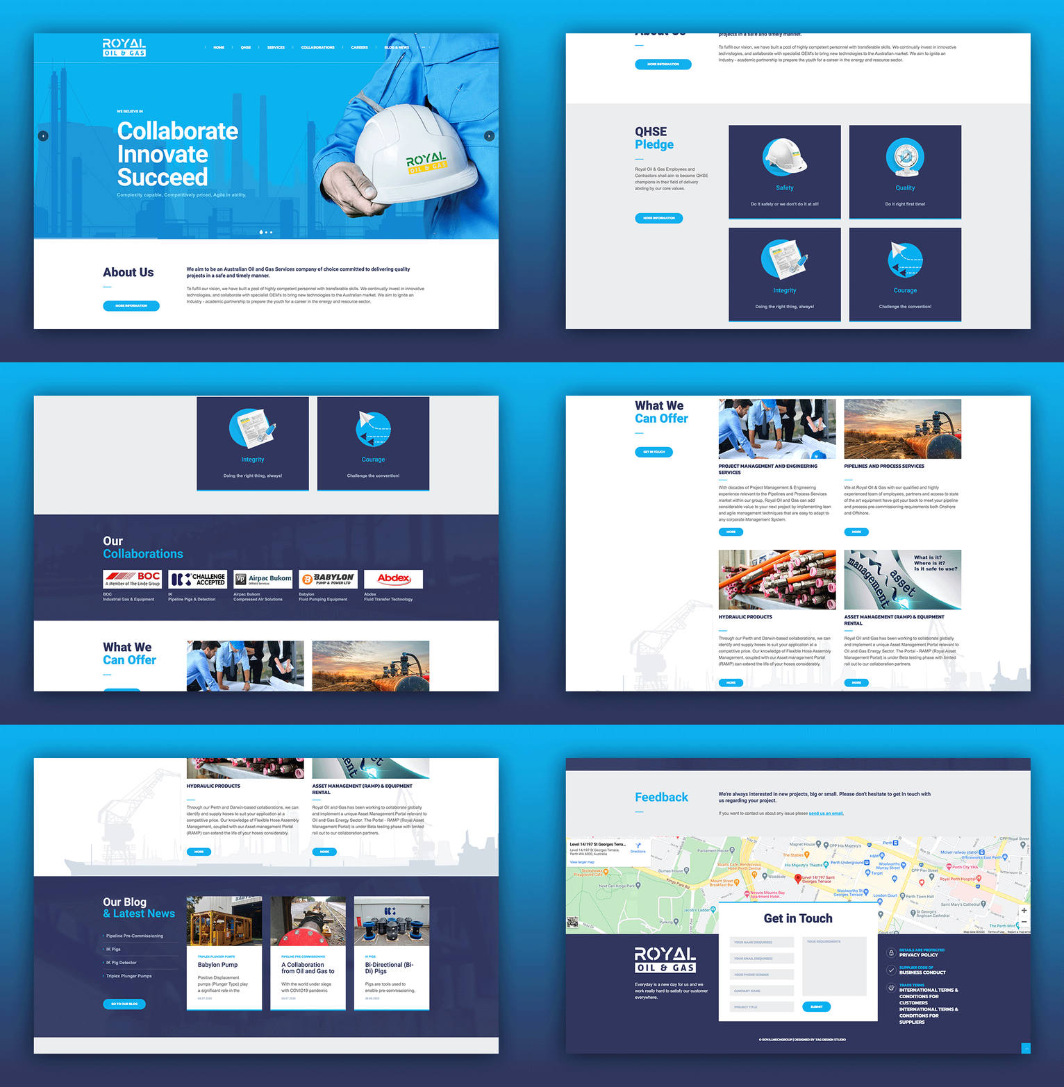
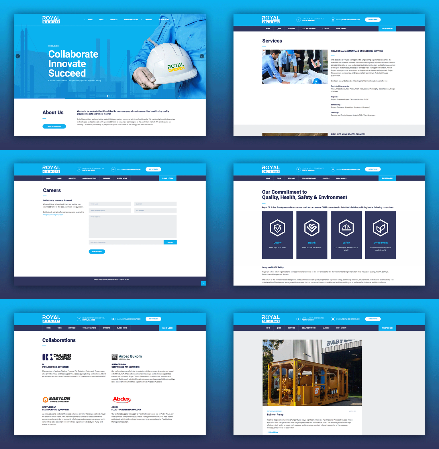
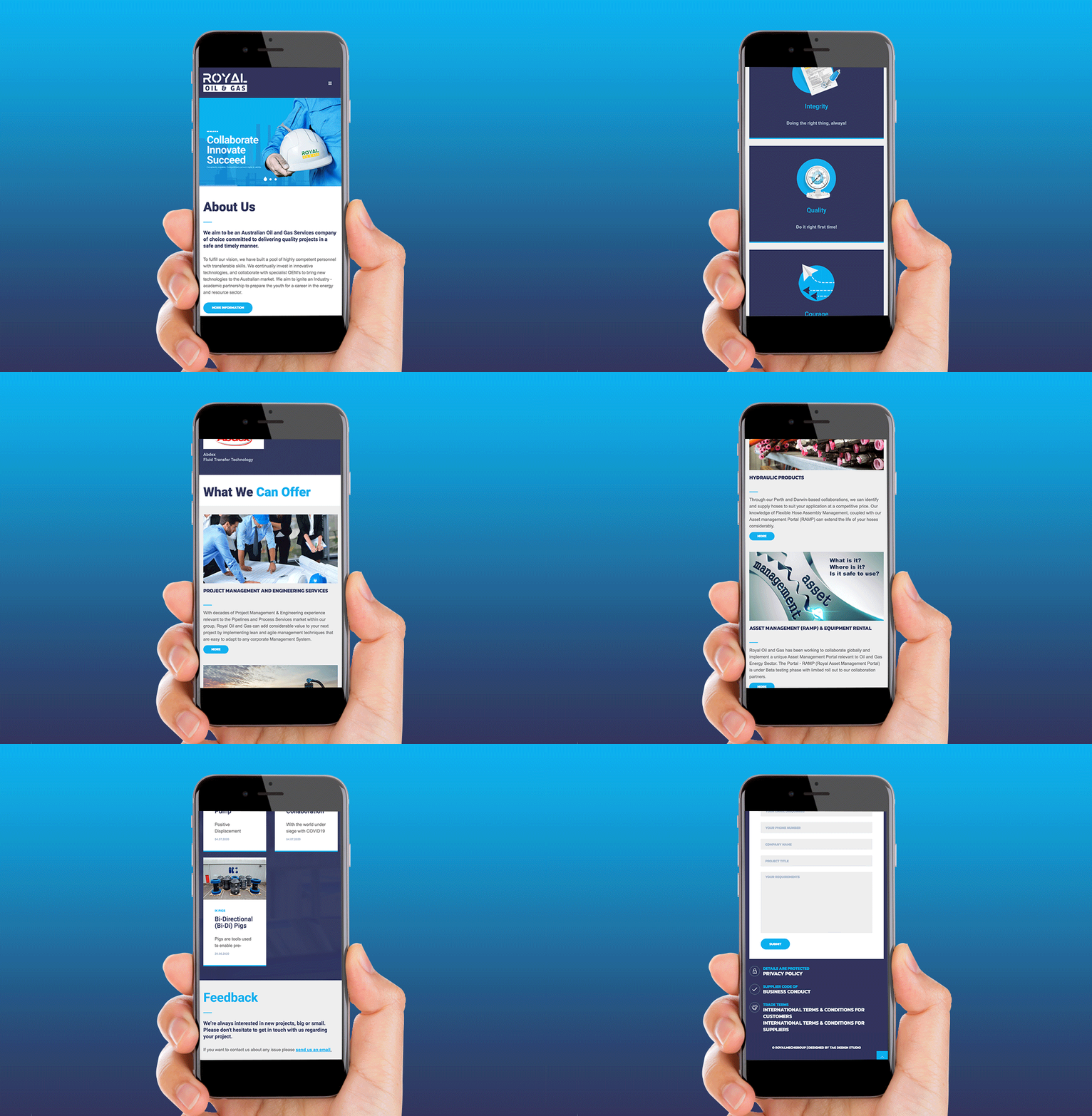
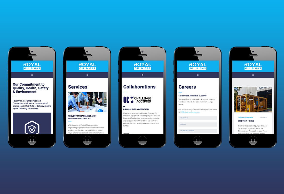
Branding and Web Design for Australia based Oil & Gas company. The project involved creating detailed brand guidelines along with the logo design. The colours of the logo were based on the colours you usually find in oil and gas, yellow and green. We used a third colour, blue to enhance the current branding and also as a secondary colour to use as a filler or as a pop of colour based on our brand guidelines for Royal Oil & Gas. The website, www.royalmechgroup.com was structured in a way so that it could communicate its aim and mission to everyone and would be easy to understand with one view that it was an Oil & Gas company. The imagery used was in line with the PPE kits, the infrastructure and everything to do with oil and gas elements.


